Visualization
Published:
This post covers Bivariate Visualization.
Bivariate
- Datasets: /posts/python/setup
%matplotlib inline

import matplotlib.pyplot as plt
import seaborn as sns

import pandas as pd
import numpy as np
Bivariate Plots
- Scatter plot
- Quantative vs Quantative
- Violin Plot
- Quantitative vs Qualitative
- Clustered Bar chart
- Qualitative vs Qualitative
Scatterplot and Correlation
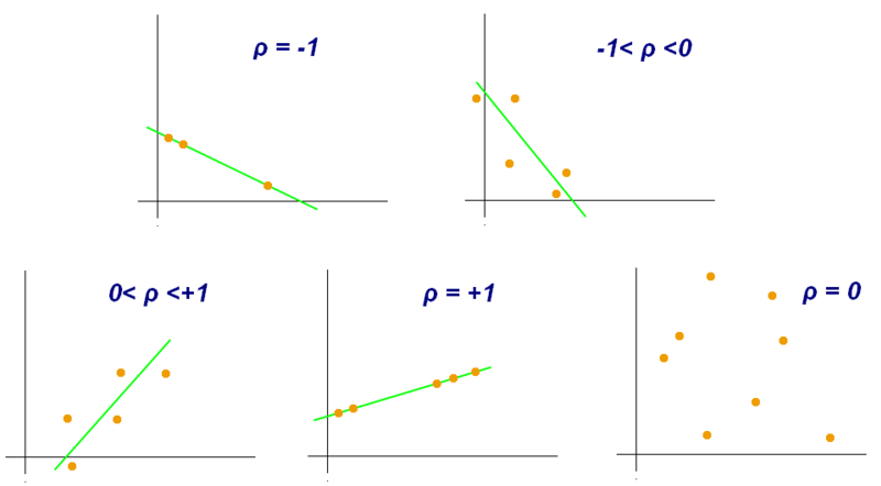
- Pearson Correlation Coefficient
- strength of linear correlation between two numeric variables
 Source: Wikipedia
- Examples of scatter diagrams with different values of correlation coefficient (ρ)
 Source: Wikipedia
- Several sets of (x, y) points, with the correlation coefficient of x and y for each set. Note that the correlation reflects the strength and direction of a linear relationship (top row), but not the slope of that relationship (middle), nor many aspects of nonlinear relationships (bottom). N.B.: the figure in the center has a slope of 0 but in that case the correlation coefficient is undefined because the variance of Y is zero.
df = pd.read_csv('./data/diabetes/diabetes.csv')
print(df.shape)
print(df.info())
Scatter plot: Quantative vs Quantative
plt.scatter(data=df, x='BMI', y='SkinThickness');
plt.xlabel('BMI', fontsize=16)
plt.ylabel('SkinThickness', fontsize=16)
plt.show()

plt.scatter(data=df, x='Glucose', y='Insulin');
plt.xlabel('Glucose', fontsize=16)
plt.ylabel('Insulin', fontsize=16)
plt.show()

plt.scatter(data=df, x='Glucose', y='BloodPressure');
plt.xlabel('Glucose', fontsize=16)
plt.ylabel('BloodPressure', fontsize=16)
sns.regplot(data=df, x='BMI', y='SkinThickness');
plt.xlabel('BMI', fontsize=16)
plt.ylabel('SkinThickness', fontsize=16)
plt.show()

sns.regplot(data=df, x='Glucose', y='Insulin');
plt.xlabel('Glucose', fontsize=16)
plt.ylabel('Insulin', fontsize=16)
plt.show()

sns.regplot(data=df, x='Glucose', y='BloodPressure');
plt.xlabel('Glucose', fontsize=16)
plt.ylabel('BloodPressure', fontsize=16);
# No explanation

sns.regplot(data=df, x='Outcome', y='SkinThickness', fit_reg=False);
plt.xlabel('BMI', fontsize=16)
plt.ylabel('SkinThickness', fontsize=16)
plt.show()

sns.regplot(data=df, x='Glucose', y='BloodPressure', fit_reg=False);
plt.xlabel('Glucose', fontsize=16)
plt.ylabel('BloodPressure', fontsize=16);
Transparency and Jitter
- too many overlapping points
sns.regplot(data=df, x='Outcome', y='SkinThickness', x_jitter=0.1, fit_reg=False, scatter_kws={'alpha':.4});
plt.xlabel('BMI', fontsize=16)
plt.ylabel('SkinThickness', fontsize=16)
plt.show()

sns.regplot(data=df, x='Glucose', y='BloodPressure', fit_reg=False, scatter_kws={'alpha':.4})
plt.xlabel('Glucose', fontsize=16)
plt.ylabel('BloodPressure', fontsize=16);
Heat Map
- relationship with color and density
- good for discrete quantative vs discrete quantative
bins_x = np.arange(0, 199+5, 20)
bins_y = np.arange(0, 122+5, 15)

plt.hist2d(data=df, x='Glucose', y='BloodPressure', cmin=0.6, cmap='plasma_r', bins=[bins_x, bins_y])
plt.colorbar()
plt.xlabel('Glucose', fontsize=16)
plt.ylabel('BloodPressure', fontsize=16);
df[['Glucose', 'BloodPressure']].describe()
Violin Plot: Quantative vs Qualitative
- Violin plots
- similar to box plots
- show the probability density of the data at different values, usually smoothed by a kernel density estimator.
- more informative than a plain box plot
- shows summary statistics such as mean/median and interquartile ranges
- violin plot shows the full distribution of the data
- useful when the data distribution is multimodal (more than one peak)
- violin plot shows the presence of different peaks, their position and relative amplitude
sns.violinplot(data=df, x='Outcome', y='Glucose');
color = sns.color_palette()[0]
sns.violinplot(data=df, x='Outcome', y='Glucose', color=color, inner=None);
plt.xticks(range(2), ['No Diab', 'Diab'], fontsize=16);
color = sns.color_palette()[0]

sns.violinplot(data=df, x='Outcome', y='Glucose', color=color, inner='quartile');

plt.xticks(range(2), ['No Diab', 'Diab'], fontsize=16);
Box Plot
sns.boxplot(data=df, x='Outcome', y='Glucose');

plt.xticks(range(2), ['No Diab', 'Diab'], fontsize=16);
Clustered Barchart: Qualitative vs Qualitative
df = pd.read_csv('./data/titanic/train.csv')
print(df.shape)
print(df.info())
def clean_gender(df):
    df.Gender.replace(to_replace='M', value='male', inplace=True)

    df.Gender.replace(to_replace='Male', value='male', inplace=True)

    df.Gender.replace(to_replace='F', value='female', inplace=True)

    df.Gender.replace(to_replace='Female', value='female', inplace=True)

    return df

df = clean_gender(df)
sns.countplot(data=df, x='Survived', hue='Gender');

plt.xticks(range(2), ['Not Survived', 'Survived'], fontsize=16);
sns.countplot(data=df, x='Survived', hue='Parch');

plt.xticks(range(2), ['Not Survived', 'Survived'], fontsize=16);
df.Survived.replace(0, 'NotSurvived', inplace=True)
df.Survived.replace(1, 'Survived', inplace=True)

sns.countplot(data=df, x='Parch', hue='Survived');
plt.legend(loc='center right');
#plt.xticks(range(2), ['Not Survived', 'Survived'], fontsize=16);
Faceting
- useful when number of levels in categorical variables
df = pd.read_csv('./data/diabetes/diabetes.csv')

bins = np.arange(0, 200, 20) # to ensure same number of bins for each facet

#print(bins.shape)

g = sns.FacetGrid(data=df, col='Outcome', col_wrap=2, sharey=True);

g.map(plt.hist, 'Glucose', bins=bins);